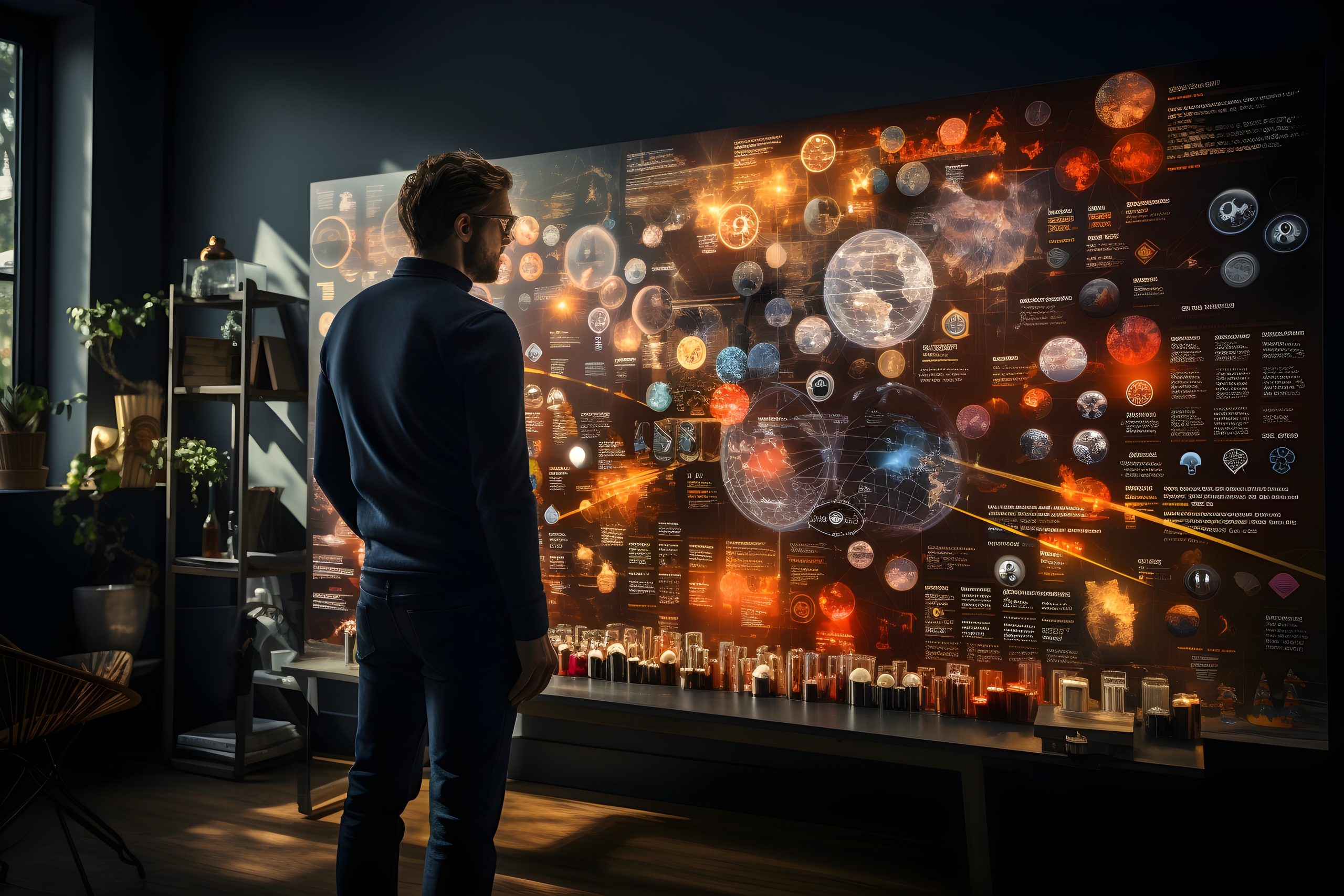
From Data to Art: The Aesthetics of Scientific Visualization
Scientific data can seem overwhelming. Numbers, figures, and charts can confuse the untrained eye. Yet, data holds hidden stories. With the right design, these stories come to life.
In this article, you will learn how to transform raw data into striking visuals. You will explore the aesthetic side of scientific visualization. We will cover the tools, techniques, and best practices that bridge art and science. By the end, you will understand why good design matters for data-driven insights.
Why Scientific Visualization Matters
Scientific visualization turns data into shapes, colors, and patterns. These visuals help us grasp complex ideas at a glance. First, they distill large datasets into meaningful forms. Next, they reveal trends, clusters, or outliers more clearly.
Visuals also break language barriers. Charts and infographics can communicate discoveries without lengthy text. In research, this can save time and improve accuracy. When data is easy to understand, better decisions follow.
How Aesthetics Enhance Data Interpretation
Merging art and science may seem unusual, but it makes perfect sense. Visual appeal draws people in. Once interested, they study the data longer. This leads to deeper understanding.
Three Aesthetic Principles
-
Balance
Balance means every element has a purpose. Crowded visuals confuse viewers. Minimal designs let patterns stand out. -
Color Harmony
Use colors that match the dataset’s purpose. Cool colors (blue, green) can show calm or stability. Warm colors (red, orange) can highlight danger or urgency. -
Contrast
Contrasting shades make elements pop. Text that contrasts with the background is easier to read. This also applies to highlighting crucial data points.
Essential Tools and Techniques for Scientific Visualization
Turning numbers into stunning visuals often requires specialized tools. Each tool has unique features. Below are some common options.
Popular Software and Libraries
-
Tableau
Ideal for beginners and pros. Drag-and-drop features make data exploration simple. -
Python Libraries
- Matplotlib: Basic plotting for quick charts.
- Seaborn: Beautiful statistical visualizations with minimal code.
- Plotly: Interactive visualizations that adapt to user input.
-
R Packages
- ggplot2: A grammar of graphics approach for advanced customization.
- Shiny: Builds interactive web apps for data analysis.
Key Techniques
-
Mapping Data to Shapes
Assign meaning to specific geometrical shapes. Circles might represent quantities, while lines show trends. -
Scaling and Normalization
Ensure large and small values remain visible. Proper scaling prevents important data from shrinking into invisibility. -
Labeling and Tooltips
Provide extra information on hover or click. This interactive element adds context without cluttering the main view.
Real-World Applications of Data-Driven Art
Scientific visualization is more than pretty pictures. It solves real problems. Here are a few examples:
Medical Imaging
Doctors rely on visual scans to spot diseases. MRI and CT scans are forms of data visualization. By adjusting brightness and color, hidden problems become visible.
Climate Science
Heat maps show rising temperatures. Graphs can track carbon dioxide over years. These visuals alert policymakers and the public to urgent changes.
Astronomy
Space telescopes collect massive data. Scientists use color filtering to reveal cosmic phenomena. These images guide research and inspire public interest.
Best Practices for Creating Scientific Visualizations
Effective scientific visualization requires care. Here are some best practices:
-
Know Your Audience
Tailor visuals to the viewer’s level of expertise. Too much detail can distract novices. Too little detail can bore experts. -
Choose the Right Chart Type
Bar charts work for comparisons. Line charts are best for trends. Pie charts are for proportions. Use the chart type that fits the data story. -
Avoid Information Overload
Limit data points to those that matter most. Extra details can dilute the main message. Clarity often comes from removing unnecessary elements. -
Label Everything Clearly
Clear labels guide viewers through the data. Axes, legends, and annotations add context. Without them, interpretation can go astray. -
Test for Accessibility
Ensure colors are accessible to color-blind audiences. Offer alternative text for visual elements. This makes your visualization usable for all.
The Future of Scientific Visualization
Technology evolves quickly. Scientific visualization stands at the forefront. Finally, we see trends that promise even more captivating representations.
-
Virtual Reality (VR)
VR immerses you in data. Explore 3D models or walk through complex structures. -
Augmented Reality (AR)
Overlay data on real-world objects. This can help in fields like engineering or architecture. -
Interactive Dashboards
With touch screens, data becomes engaging. Users can drill down or switch views easily.
These advances bridge the gap between data and the human mind. They push the boundaries of “From Data to Art: The Aesthetics of Scientific Visualization.”
Conclusion
From data to art, the aesthetics of scientific visualization highlight the power of design. Well-crafted visuals engage viewers and reveal hidden insights. They can break down language barriers and simplify complex ideas. By applying best practices and using the right tools, you can transform numbers into works of art.
This article’s purpose is to drive traffic and generate leads by offering practical insights. It also serves as an educational resource. We have explored how art and science blend to deliver meaningful data experiences. Now, it’s your turn to bring data to life.
Frequently Asked Questions
1. What is scientific visualization?
Scientific visualization is the practice of converting data into visual formats. It helps people see patterns, trends, and insights faster than plain text.
2. Why does aesthetics matter in scientific visualization?
Aesthetics capture attention and spark curiosity. When visuals look pleasing, viewers are more likely to engage and understand.
3. Which tools are best for creating data-driven art?
Tools depend on your needs. Tableau, Python libraries (Matplotlib, Seaborn, Plotly), and R packages (ggplot2, Shiny) are popular options.
4. How do I choose the right chart type?
Match the chart type to your goal. Bar charts compare values. Line charts track changes over time. Pie charts show parts of a whole.
5. How can I ensure my visualizations are accessible?
Use colorblind-friendly palettes and clear labels. Provide alternative text for images. Test your designs with various audiences.
Author Profile

- Online Media & PR Strategist
- Hello there! I'm Online Media & PR Strategist at NeticSpace | Passionate Journalist, Blogger, and SEO Specialist
Latest entries
 Artificial InteligenceApril 30, 2025Master Prompt Engineering Techniques for Better AI Output
 HPC and AIApril 30, 2025AI and HPC in Gaming: Realistic Virtual Worlds Today
 Robotics SimulationApril 30, 2025How Robotics Simulation Agriculture Is Changing Farming
 VirtualizationApril 30, 2025Future-Proof Virtualization Strategy for Emerging Tech