The Art of Scientific Visualization Aesthetics Explained
Why Scientific Visualization Aesthetics Matter
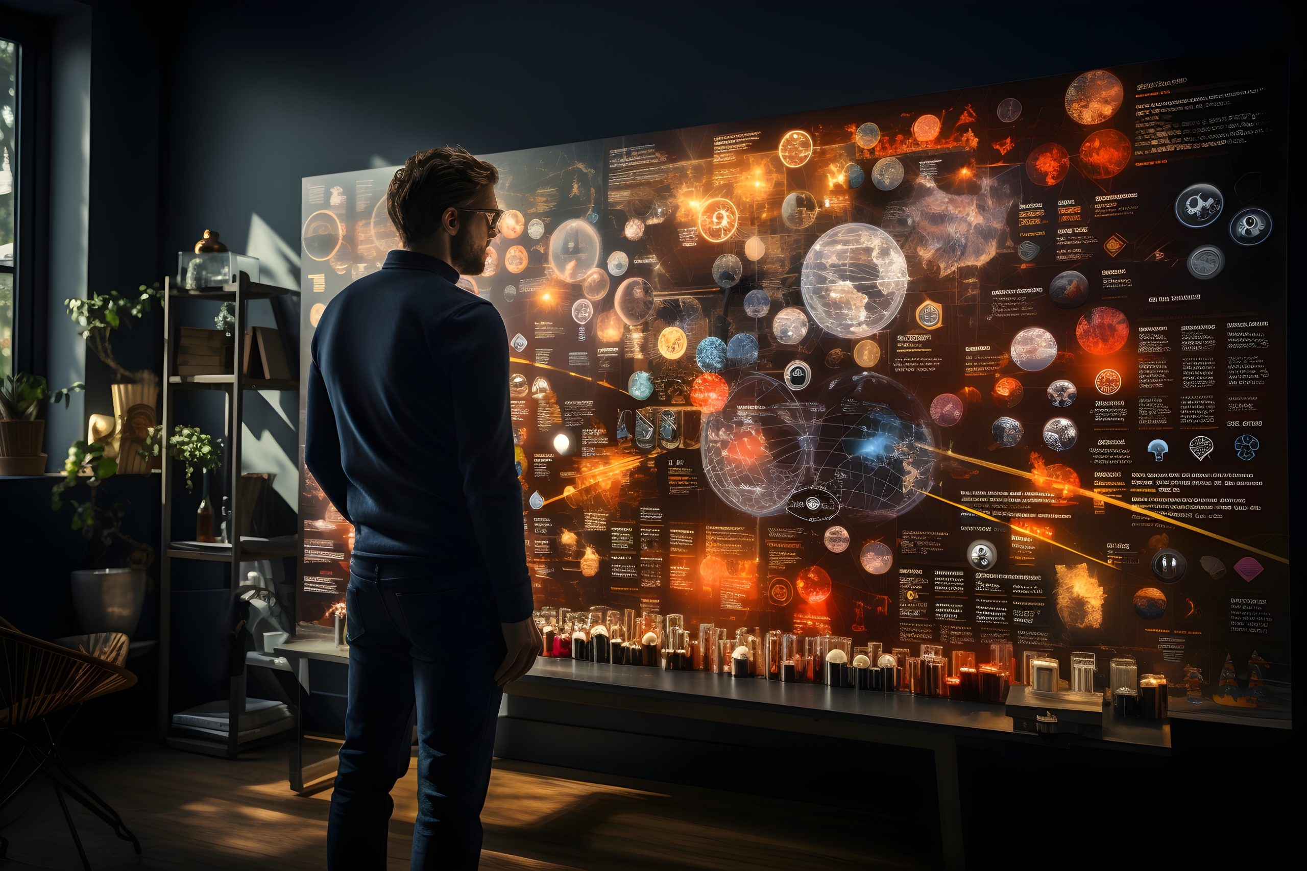
Have you ever looked at a weather map or medical scan and instantly understood the story behind the data? That’s the power of scientific visualization aesthetics. It transforms complex numbers into simple, clear, and often beautiful visuals.
In this post, you’ll learn what scientific visualization aesthetics are, why they matter, and how they help make data easier to understand. We’ll cover design principles, tools, examples, and answer common questions at the end.
What Are Scientific Visualization Aesthetics?
Scientific visualization aesthetics refers to the design and artistic presentation of scientific data. It’s about how charts, graphs, and models look—so they’re not just accurate, but also easy to read and interpret.
Key goals include:
-
Improving clarity
-
Highlighting important patterns
-
Making data engaging for wider audiences
A well-designed visualization helps both scientists and non-experts see insights faster.
Principles of Effective Scientific Visualization Aesthetics
Great scientific visuals follow specific rules that balance design and function.
1. Clarity Over Complexity
Avoid clutter. Use clean layouts, clear labels, and only the data you need.
2. Color Use
Colors can show categories, trends, or depth. Be careful with red-green combos—many people are colorblind.
3. Focus on the Message
Start with the question: “What should viewers learn?” Every design choice should support that.
4. Interactive Elements
Tools like D3.js and Plotly let you create dynamic charts where users can explore the data.
Tools That Support Scientific Visualization Aesthetics
Several tools are made for crafting high-quality scientific visuals.
Popular Software:
-
Tableau – User-friendly, with strong aesthetic defaults
-
Python (Matplotlib, Seaborn) – Flexible, code-based design
-
R (ggplot2) – Great for academic publications
-
ParaView & VTK – Ideal for 3D and large data sets
Explore our guide on data visualization tools for developers to learn more.
Real-World Examples of Scientific Visualization Aesthetics
1. Climate Change Maps
NASA’s global temperature charts show rising heat levels in stunning visuals.
2. COVID-19 Dashboards
Johns Hopkins’ dashboard used color, layout, and interactivity to explain trends.
3. Medical Imaging
MRI and CT scans use advanced 3D visualization to help doctors diagnose patients accurately.
Each of these uses scientific visualization aesthetics to simplify life-saving insights.
Why Businesses Should Care About Scientific Visualization Aesthetics
Even if you’re not a scientist, this applies to you.
Benefits:
-
Better presentations
-
Clearer reporting
-
Stronger impact from analytics
Visuals that follow scientific visualization aesthetics help teams align, customers engage, and leaders make smarter decisions.
Best Practices for Scientific Visualization Aesthetics
Do:
-
Keep it simple and focused
-
Use color with intention
-
Label everything clearly
-
Test with real users
Avoid:
-
Over-designing with animations
-
Using too much data in one view
-
Forgetting your audience
Want to apply these in business? Check our post on data storytelling in IT reports.
FAQs
What makes a visualization “aesthetic”?
It’s not just beauty. It’s clear, clean design that makes the data easier to understand and remember.
Do I need a design background?
Not at all. Tools today make it easier than ever. You just need to follow basic principles.
Where is it used most?
Science, health, finance, education, and IT. Basically anywhere data needs to be understood quickly.
How do I get started?
Try free tools like Tableau Public or Jupyter Notebooks. Start small—then scale up.
Turning Numbers Into Visual Stories
Art of scientific visualization bridge the gap between data and understanding. Whether you’re a developer, analyst, or student, mastering this skill can make your work clearer and more powerful.
Use it to tell better stories with data—stories that inform, engage, and inspire action.
Author Profile

- Online Media & PR Strategist
- Hello there! I'm Online Media & PR Strategist at NeticSpace | Passionate Journalist, Blogger, and SEO Specialist
Latest entries
 AI WorkflowsMarch 18, 2026Nvidia AI Graphics Backlash Explained for Gamers Today
 NetworkingMarch 17, 2026High Speed Networking for Quantum AI Systems Growth
 Vehicle SimulationMarch 11, 2026Physical AI Integration Driving the Future of Smart Cars
 AI WorkflowsMarch 9, 2026AI Insurance Underwriting: Gradient AI Funding Impact