How to Turn Spreadsheets Into Visuals Fast and Free
Transform Spreadsheets Into Stunning Visuals Instantly
Now you can turn your spreadsheets into stunning visuals in seconds using free online tools like Flourish Studio. Just upload your Excel file and choose from dynamic visuals like bubble charts, tree maps, pictograms, and sunbursts. This article will show you how easy it is to get started and explain how these tools can improve your presentations and reports—no design skills required.
If you’re tired of boring charts and long tables, it’s time to make your data work harder. This post is for IT professionals, educators, marketers, and anyone who works with spreadsheets.
Why You Should Turn Spreadsheets Into Visuals
If you’re still using static pie charts or line graphs, you’re missing out on the impact of modern data visualization.
Here’s why transforming spreadsheets into visuals is so effective:
-
Visuals make data easier to understand
-
Charts can highlight trends and patterns instantly
-
Presentations look more professional and polished
-
It saves time compared to manual design work
With tools like Flourish, you can do all of this with just a few clicks. No need to download anything or learn complex software.
How to transform spreadsheets into images With Flourish
Getting started with Flourish is quick and easy:
Step 1: Upload Your Excel File
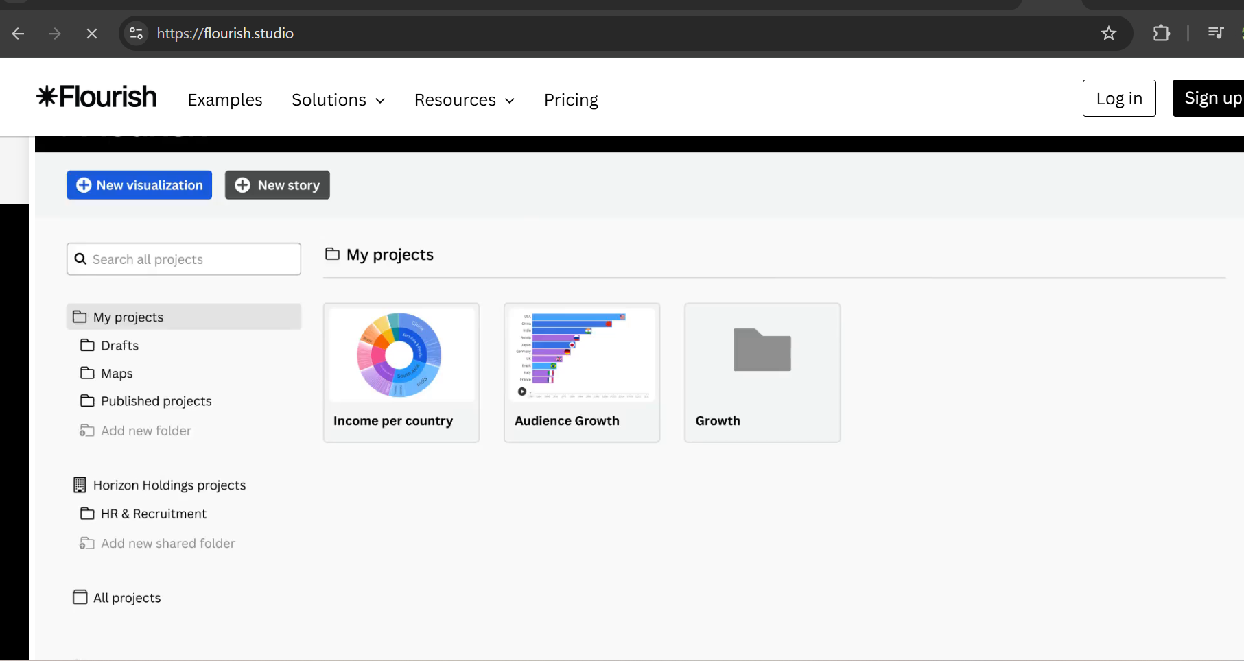
First, head over to flourish.studio. Click “New visualization” and upload your spreadsheet. Make sure your data is formatted in rows and columns.
Step 2: Choose a Chart Type
Next, pick the chart type that fits your story. Flourish offers:
-
Bubble charts
-
Pictograms
-
Sunbursts
-
Tree maps
-
Column & bar charts
You can even preview each chart in real time.
Step 3: Customize Your Visual
Use the sidebar to change colors, labels, and styles. You can make your charts interactive too—great for web reports and dashboards.
Step 4: Publish or Embed
Finally, publish your chart, download it, or embed it directly into your website or PowerPoint presentation.
Best Charts to transform spreadsheets into images
1. Bubble Charts
Perfect for showing relationships between three variables. Each bubble’s size, position, and color can represent different metrics.
2. Pictograms
These use icons instead of bars to make stats more engaging. Great for infographics and reports.
3. Sunburst Charts
Visualize hierarchical data in a colorful, circular layout. Ideal for nested data structures.
4. Tree Maps
Show proportions between categories using nested rectangles. Excellent for summarizing large data sets at a glance.
Who Should Turn Spreadsheets Into Visuals
This approach isn’t just for designers. It’s great for:
-
IT Analysts needing clear dashboards
-
Teachers creating classroom visuals
-
Marketers pitching reports to clients
-
Business professionals making slide decks
When you transform spreadsheets into images, you make your message clearer and more memorable.
Tools Besides Flourish to Turn Spreadsheets Into Visuals
While Flourish is our top pick, here are other helpful tools:
-
Datawrapper – Simple and quick chart building.
-
Google Charts – Great for embedding in websites.
-
ChartBlocks – Customizable charts for social sharing.
Explore each to find the one that fits your workflow.
Tips to Effectively transform spreadsheets into images
Keep It Simple
Don’t clutter your chart. Show only what’s necessary.
Use the Right Chart Type
Match the chart to your data. A bad fit confuses your audience.
Make It Interactive
Interactivity boosts engagement, especially in web reports.
Test Across Devices
Make sure your visual looks good on phones, tablets, and desktops.
FAQs
What file formats does Flourish accept?
It supports Excel (.xlsx) and CSV files.
Is Flourish free to use?
Yes, there’s a free tier with most features available.
Can I use Flourish visuals in PowerPoint?
Absolutely. You can download visuals as images or embed them live.
Is coding required?
No. Flourish is designed for non-technical users.
Start Turning Your Spreadsheets Into Visuals Today
In just minutes, you can go from raw data to stunning charts. Whether you’re building a pitch deck, report, or dashboard, transform spreadsheets into images to make your data clear and impactful.
Start today with Flourish Studio and transform how you present data. And findout more AI platforms about here.
Author Profile

- Online Media & PR Strategist
- Hello there! I'm Online Media & PR Strategist at NeticSpace | Passionate Journalist, Blogger, and SEO Specialist
Latest entries
 AI WorkflowsJune 16, 2026Reliable AI Systems: Why Probably’s $9M Funding Matters
 AI WorkflowsJune 15, 2026AI Shopping Agents: Why Consumers Trust Them More
 AI WorkflowsJune 15, 2026HarmonyOS AI Ecosystem Powers China’s Next AI Wave
 Cyber SecurityJune 13, 2026AI Scam Network: Google Takes on Global Cyber Fraud