Visualizing Climate Change
Introduction
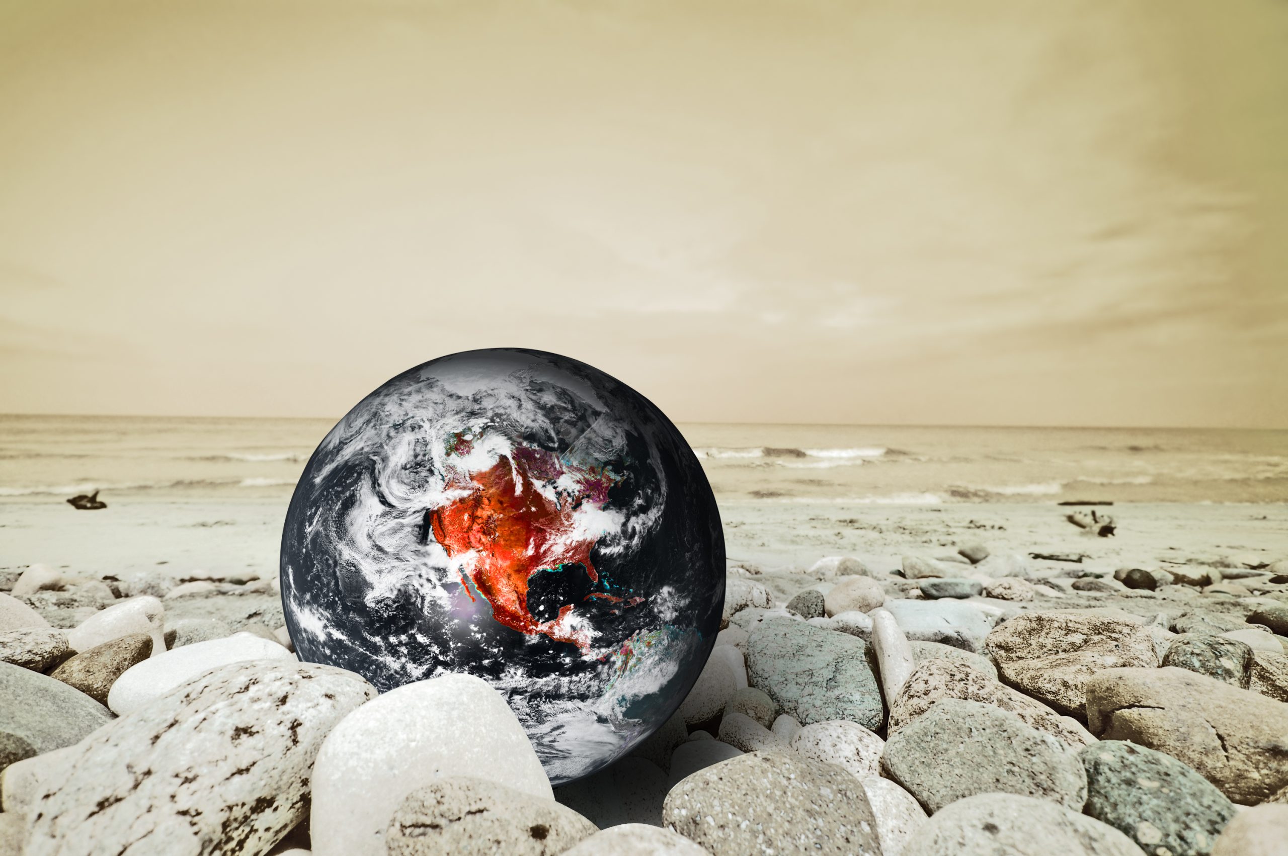
Many struggle to understand climate change. Visualizing Climate Change with IT tools makes global warming clear. In this blog, you’ll learn how tech turns raw data into visuals that show climate risks.
How Climatology Works
Turning Data Into Visual Stories
Climatology means turning climate data into maps, graphs, and animations. This helps people see rising temperatures and changing weather patterns.
-
Satellites collect daily Earth data.
-
Climate models show possible futures.
-
Interactive maps explain local impacts.
Explore NASA Climate for examples.
IT Tools for Visualizing Climate Change
Software and Platforms for Visualizing Climate Change
Several tools help with Climatology:
-
GIS Maps — show warming trends and sea-level rise.
-
Climate Dashboards — websites like Climate.gov offer live data.
-
Virtual Reality — lets you see flooded cities or melting ice caps.
Why Climatology Matters
Clear Benefits of Visualizing Climate Change
Climatology helps everyone:
-
Understand: Visuals make data easy to grasp.
-
Learn: Schools use them to teach climate science.
-
Act: Leaders plan actions based on clear visuals.
Seeing makes believing.
How IT Experts Build Climate Visuals
Tech Roles in Climatology
IT pros play a big part:
-
They code climate models.
-
They design clear dashboards.
-
They check that data is correct.
If you love tech and the Earth, this career is for you.
Challenges in Visualizing Climate Change
Common Problems
There are some hurdles in Climatology:
-
Too much data can confuse people.
-
Bad visuals may spread wrong info.
-
Some lack good internet to view them.
Better tools fix these problems.
The Future of Climatology
What’s Ahead
Visualizing Climate Change will improve with new tech:
-
AI may predict climate trends faster.
-
Open data lets anyone build visuals.
-
Mobile apps bring updates to your phone.
Stay updated at UN Climate Change.
FAQs
What does Climatology mean?
It means showing climate data as easy-to-read visuals.
Why is Climatology important?
It helps people see and understand global warming.
Who uses these tools?
Scientists, teachers, students, and policymakers.
Where can I see climate visuals?
Check NASA Climate and Climate.gov.
Conclusion
One of the most effective approaches to help people fully comprehend the implications of global warming for our planet is to use climate change visualisation. Maps, charts, and animations make complex climate data understandable and relatable. These images show how weather patterns are changing, glaciers are receding, and sea levels are rising—changes that might otherwise seem far away or imperceptible.
Everyone can now witness actual proof of climate change in real time, from scientists to students, thanks to advancements in information technology. This increases the urgency and significance of discussions about sustainability and environmental action. People may alter their lifestyles with knowledge, communities can get ready for severe weather, and governments can plan more effectively.
Read more tech articles for ideas and read the Top Techniques for Visualizing Abstract Concepts in Science.
Author Profile
- Hey there! I am a Media and Public Relations Strategist at NeticSpace | passionate journalist, blogger, and SEO expert.
Latest entries
 AI WorkflowsJune 6, 2026Microsoft Scout Agent Transforms Productivity Across M365
 Design and SimulationApril 30, 2026Instagram Content Aggregators Rules for Reach 2026
 AI WorkflowsApril 29, 2026Agentic AI Model: GPT-5.5’s Biggest Leap Yet Explained
 Robotics SimulationApril 17, 2026Robot Brain Technology Transforms Modern Robotics Systems